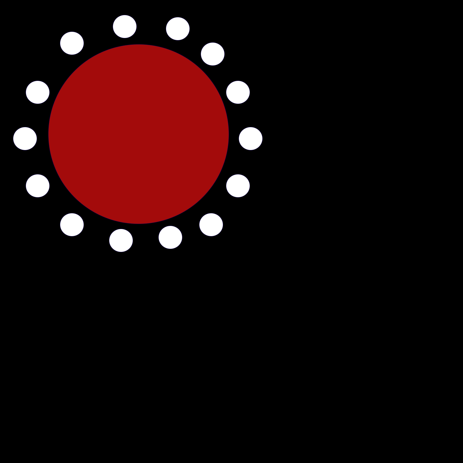
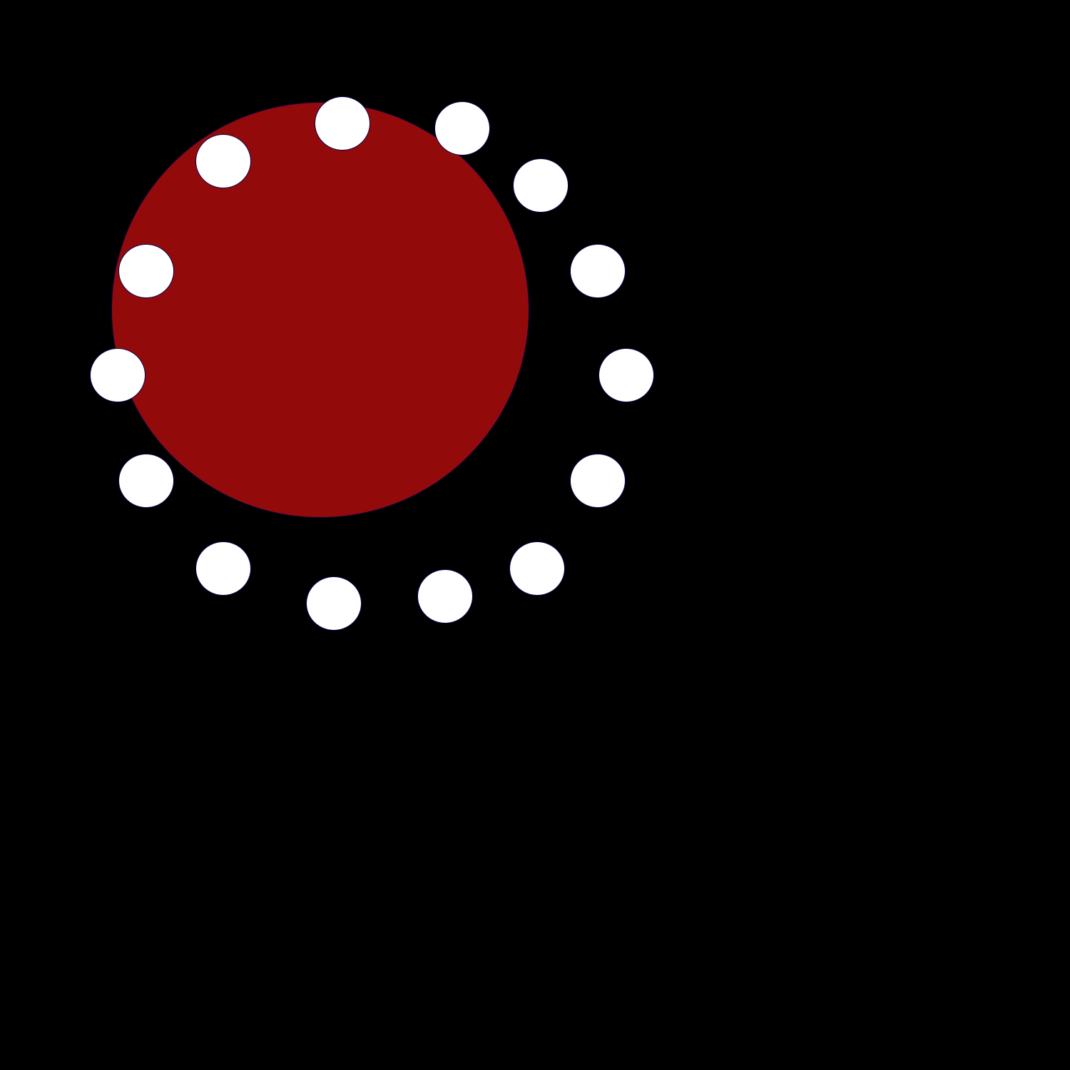
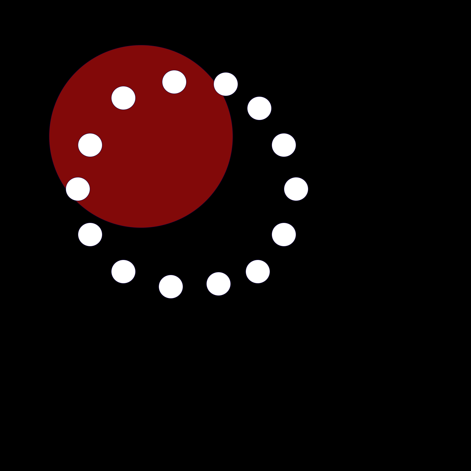
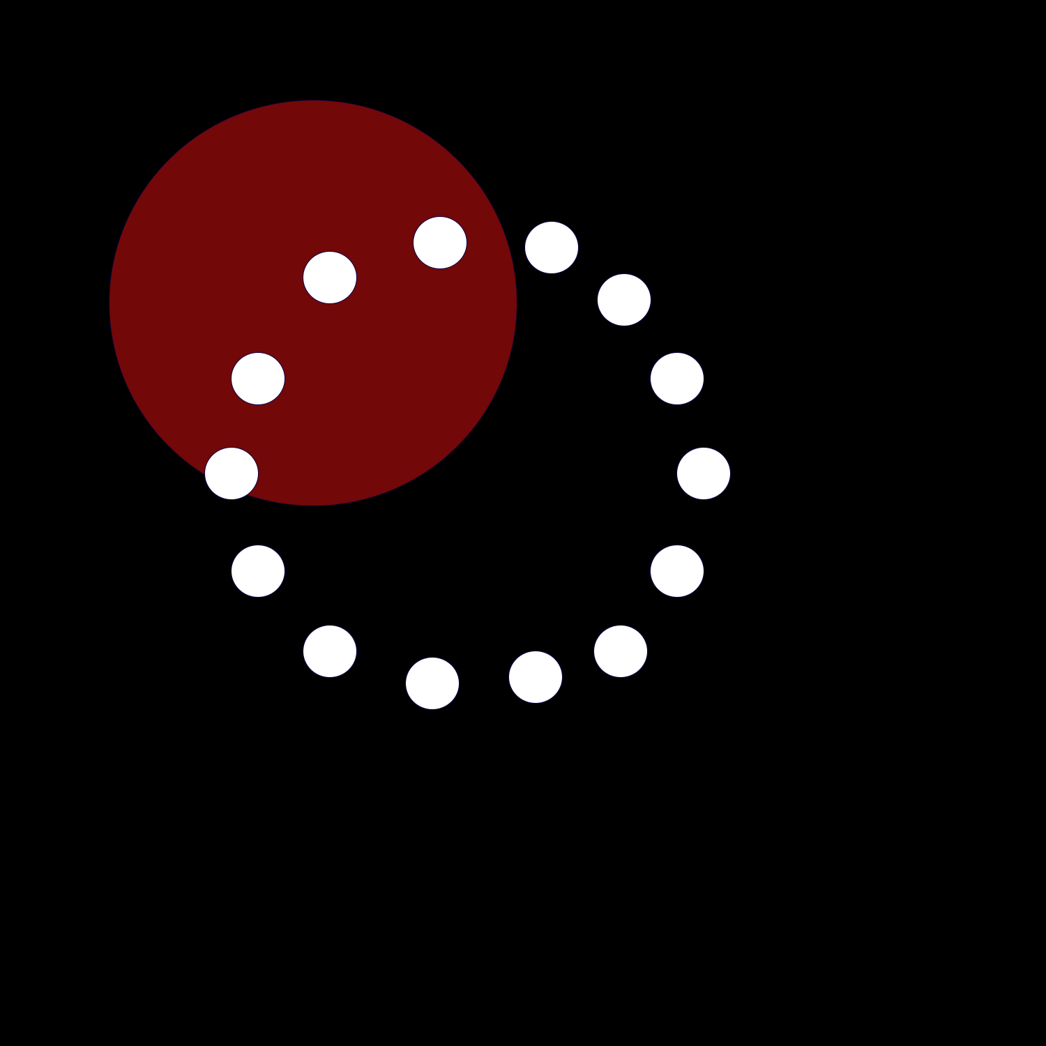
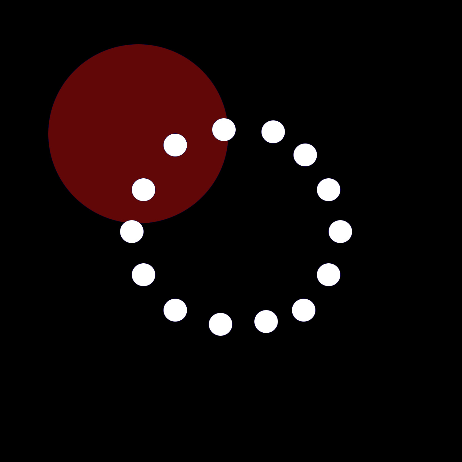
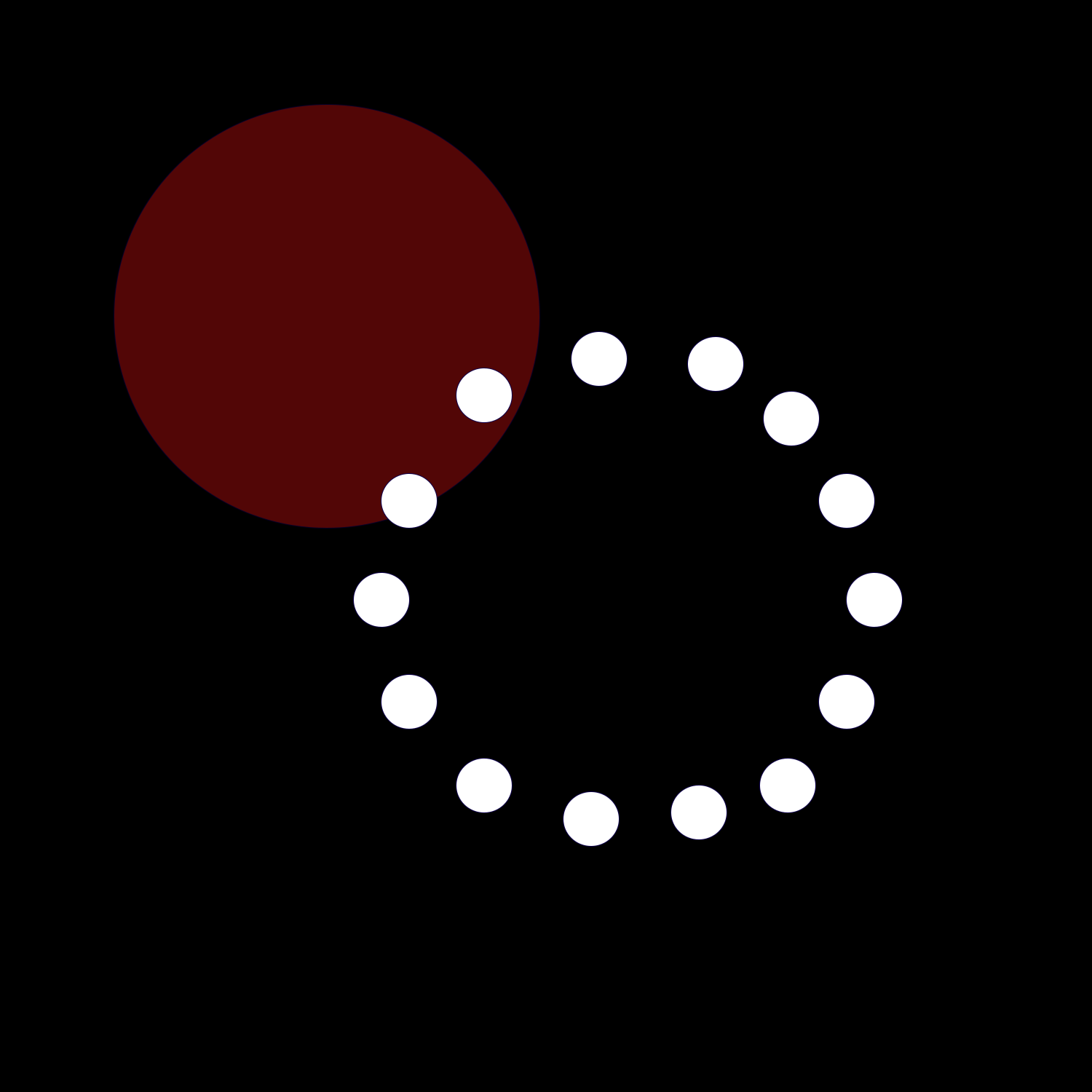
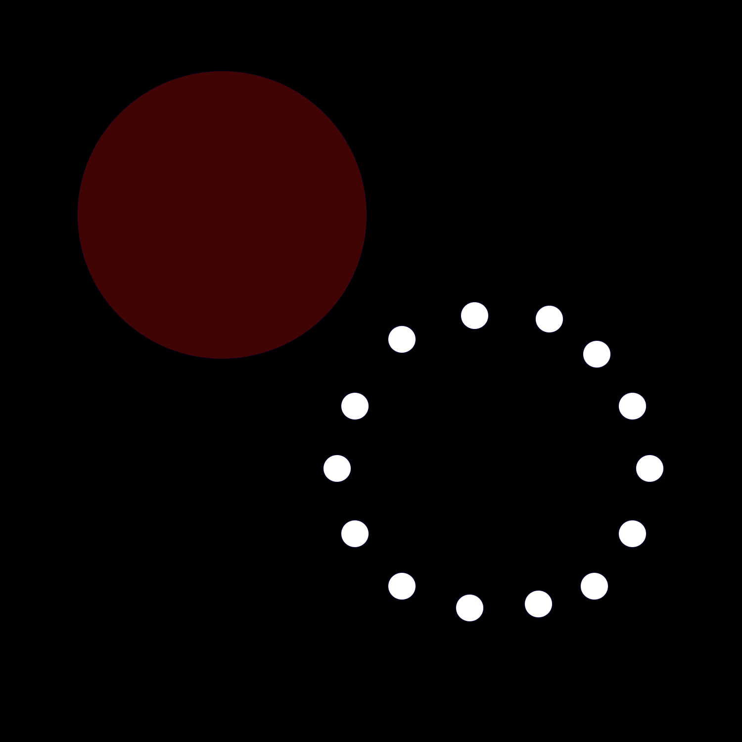
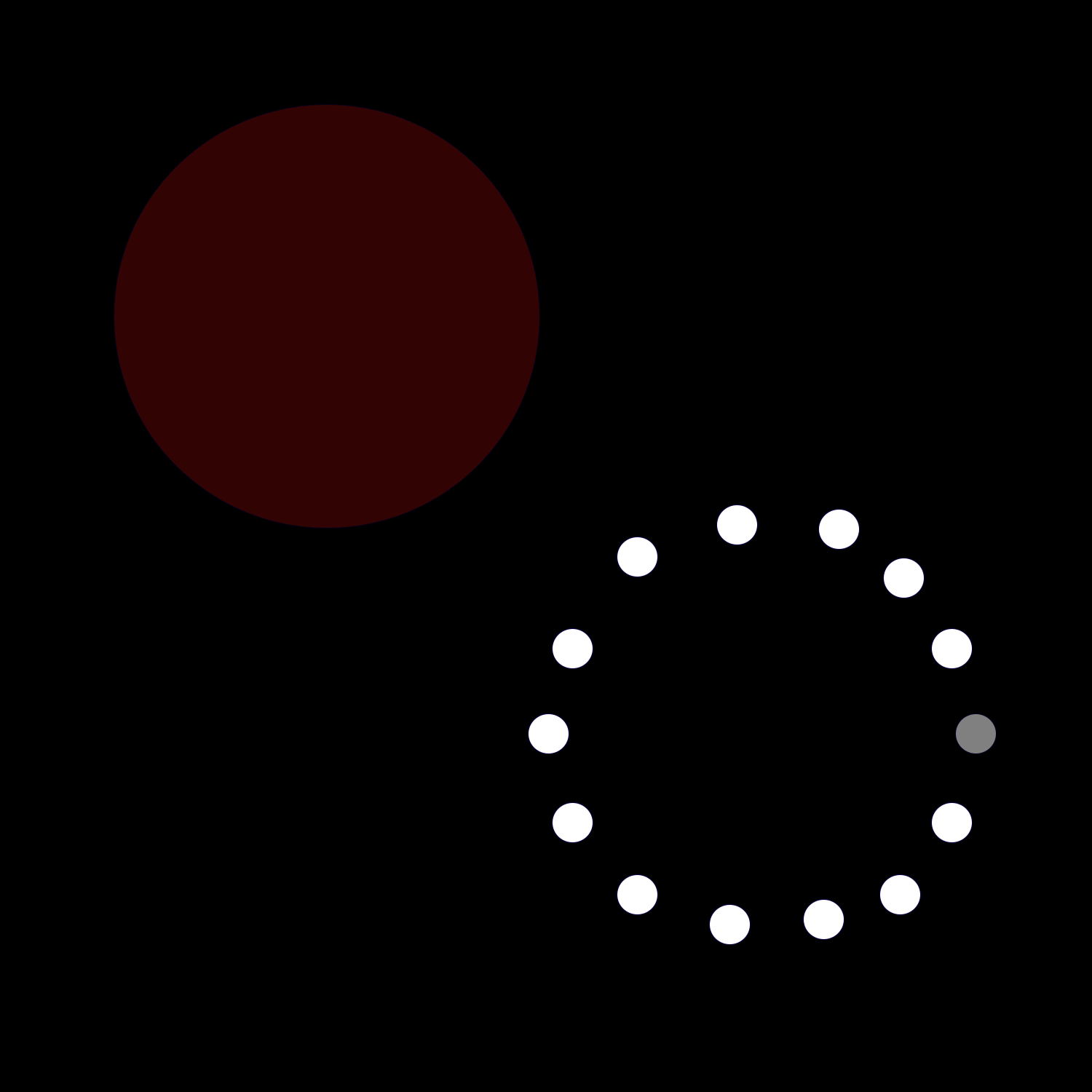
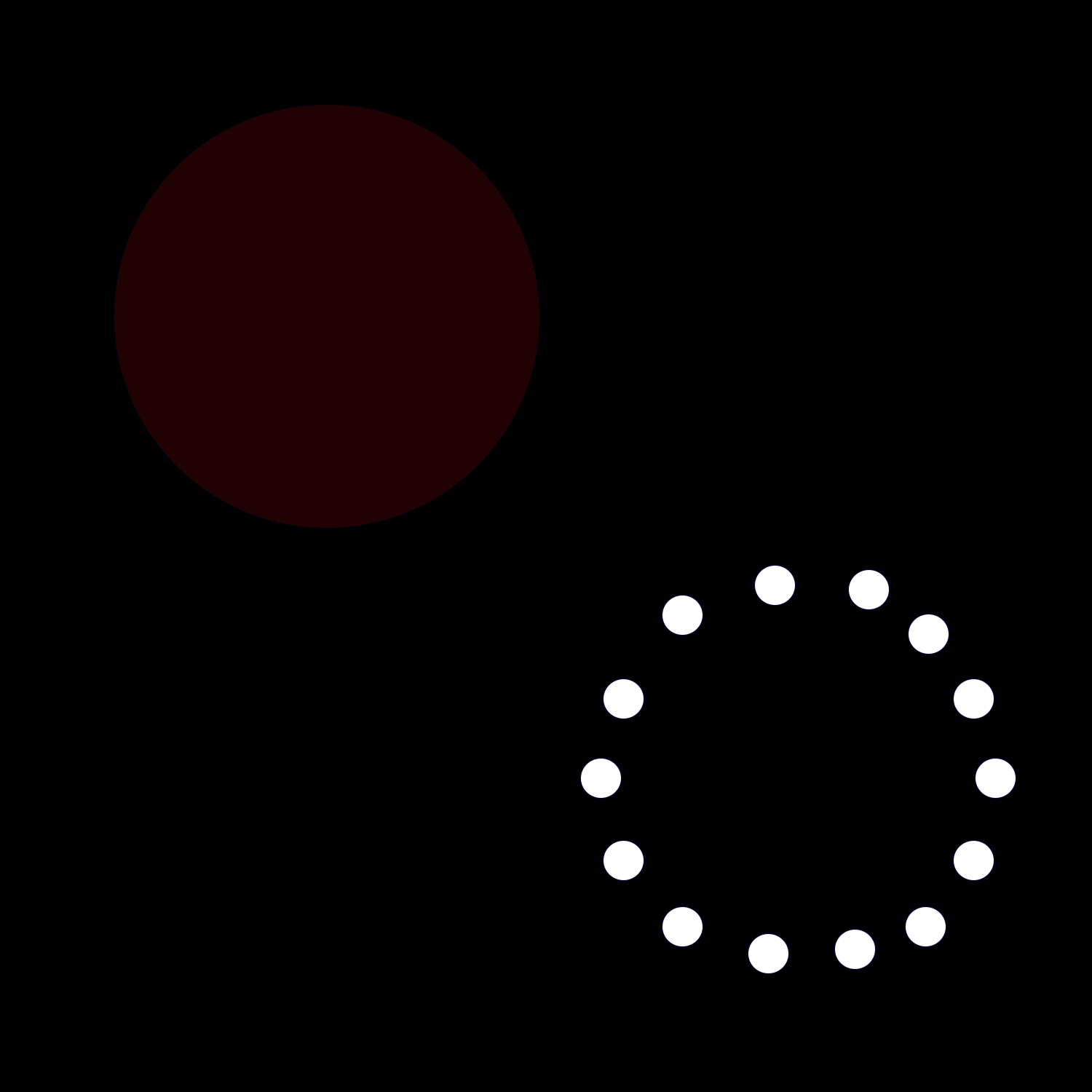
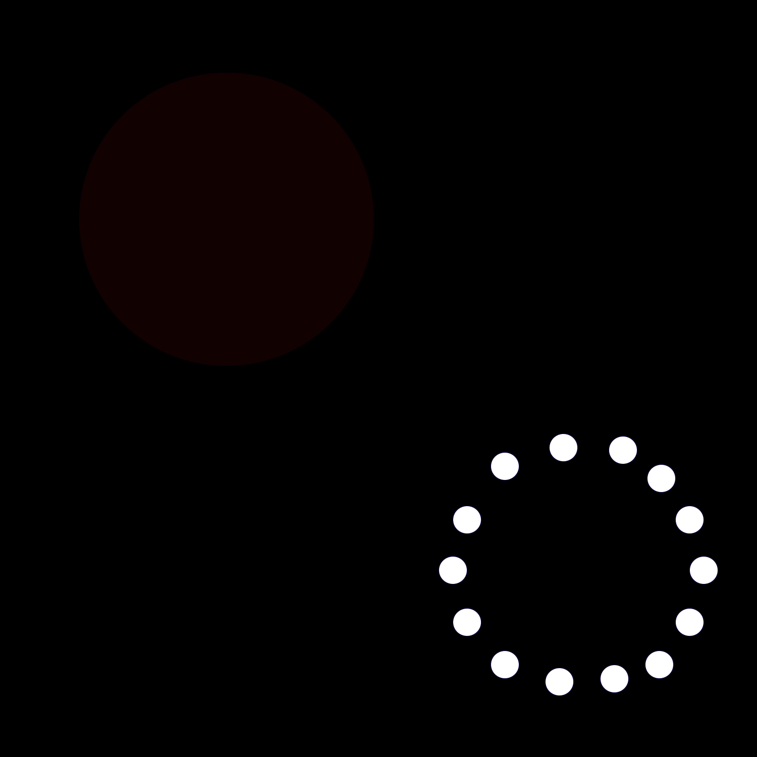
This design represents the idea of toxicity and how its impact diminishes as people move away from it. The large red circle in the center symbolizes the source of toxicity, while the smaller white circles around it represent individuals breaking free from its influence. The smaller white circles form an imperfect ring because it shows how us as humans are and highlights our imperfections. As the white circles move further away, the red one fade into the black background, the toxicity weakens and eventually disappears as distance increases. The progression portrays how stepping away from toxic environments can lead to clarity and freedom.
Creating this design was challenging because I was limited to using just one color (red) and its shades for the shapes. This restriction forced me to focus on composition and contrast to convey the message effectively. The red had to stand out as the core of toxicity, while the white circles needed to create a sense of movement. It was pretty tricky to get my story across using just one color/its shades with the shapes.
