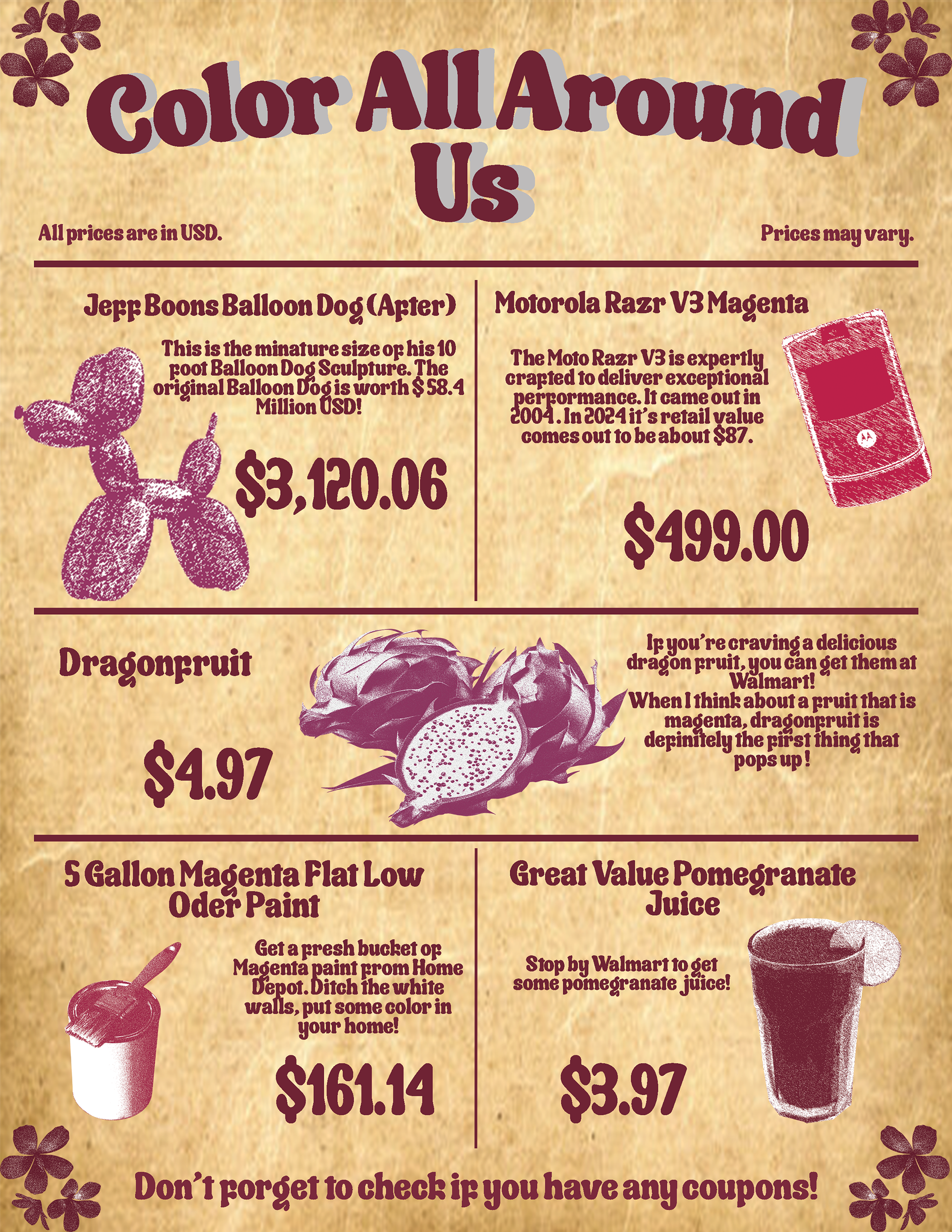
This design was inspired by the vintage vibe of old grocery store newspaper ads. The sepia-toned background, the font and floral accents all work together in my opinion. I wanted to showcase a collection of products tied together by magenta tones. Originally, I was going for a pomegranate juice color. Along the way, I realized that the pictures I found ranged more from fuchsia to magenta, which was tricky for me to spot since I’m slightly colorblind. Even though this made finding the right tones harder, I think the final palette still ties everything together nicely.
I used the eye dropper tool to highlight the main color of each aspect, so I wouldn't change the color of the original object. I also decided to keep all of the price tags the same size so they would pop out. Finding products that matched the color scheme was honestly a bit of a struggle since color representation online isn’t always consistent. It took a lot of time to piece together this collection. I also worked in feedback from my professor, who suggested leaning into the old-school grocery ad look, and I think that really helped make the design stand out. An interesting fact I discovered while doing research was that "there is no wavelength of light for magenta" which means that our brains essentially make the color up.