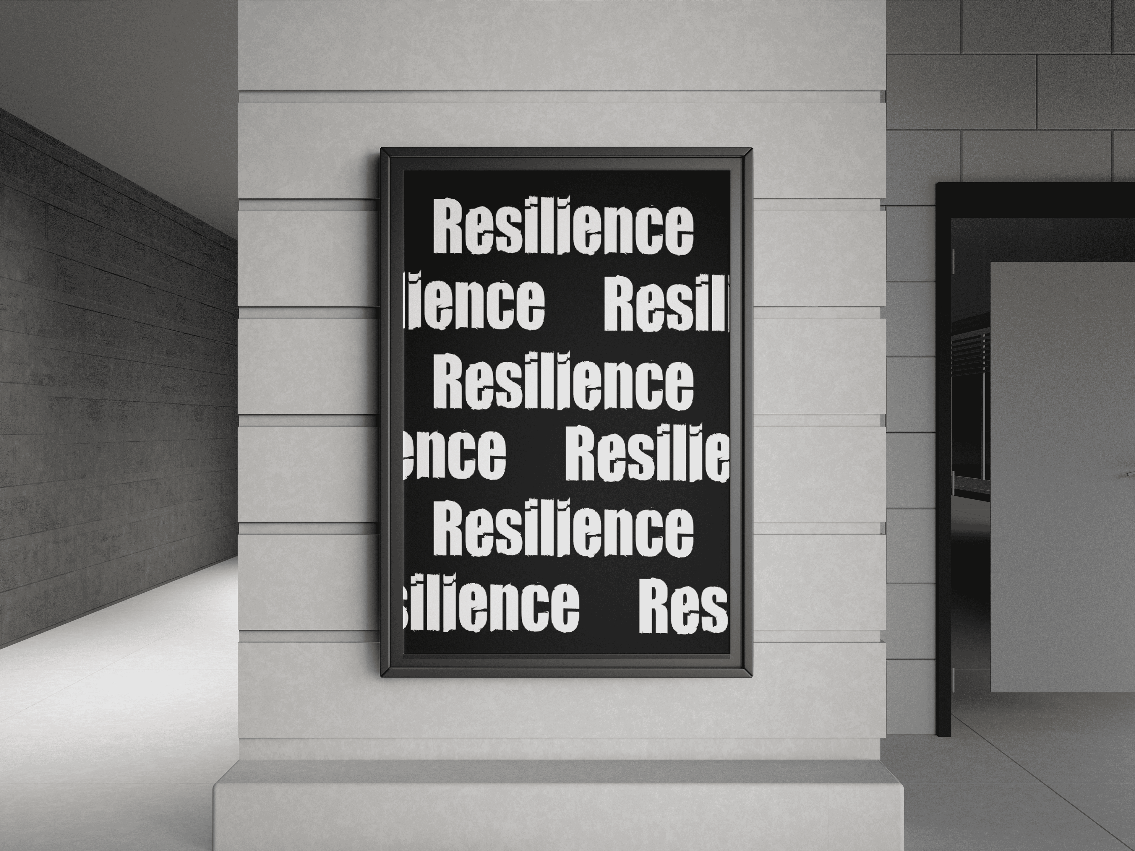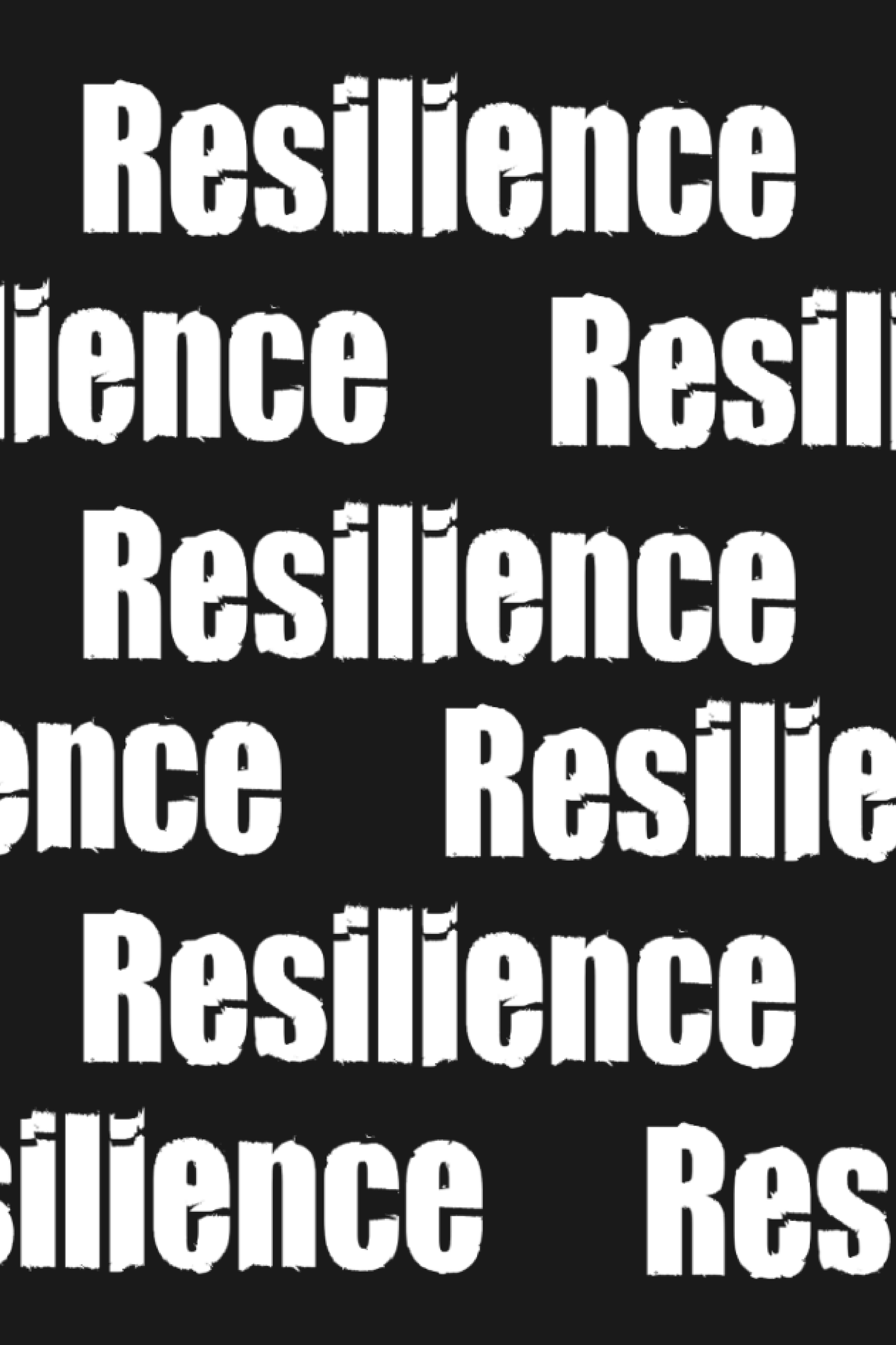
This monochrome poster is about the word "Resilience" repeated in a bold, slightly rough font that makes it distinguished. The word is cut off at the end of a line but continues perfectly on the opposite side, to show that it’s pushing through obstacles to keep going. It symbolizes resilience; finding a way to keep moving forward no matter what.
Making a poster in black and white wasn’t easy because there’s no color to add emotion, especially when we were told we couldn’t add any images. Instead, everything depends on the font, the layout, and the overall vibe. The distressed look of the letters gives off an imperfect feel. The words break apart and then reconnects, it displays what resilience is: broken sometimes, but never completely stopped. It’s simple but powerful, and I believe it gets the message across.